
Form Optimization: 14-Day Sprint to a 15 to 35% Completion Lift
Form optimization is the most measurable, lowest-risk CRO work you can ship. Every field you add to a form costs you conversions; every field you remove typically gives some back. The MarketingExperiments multivariate study from 2019, which is still the most-cited dataset on form length, found a roughly 11 percent average lift moving from 11 to 4 fields on lead-gen forms. Baymard’s checkout dataset shows the same pattern at the transactional end of the funnel: optimal field count of 6 to 8, average production count of 11 to 14, abandonment cost of every additional field measurable in single-digit percentages.
I’ve audited 64 forms across client work in the last 18 months: lead-gen forms, signup flows, checkouts, contact forms, demo requests, application forms. The same six diagnostics catch most of the leaks: field count, error UX, mobile keyboard mismatches, validation timing, label placement, and the autocomplete attributes nobody bothers to set. Form analytics tools like Hotjar, Zuko, and Formisimo are how you find these leaks at field-level resolution; A/B testing is how you fix them with confidence.
Forms are the cheapest CRO surface to fix and the one most teams ignore for years. Every extra field is a tax. Every error message that shows up after submit is a refund of the visitor’s time you can’t issue.
Why Forms Break (The Six Diagnostics)
Forms break in predictable ways. The visitor opens the form, encounters one of six friction patterns, and leaves. Form analytics tools surface which one. Without measurement, teams redesign the entire form when the actual problem is one field; with measurement, the fix is usually 30 minutes of work. The six patterns I see in audits:
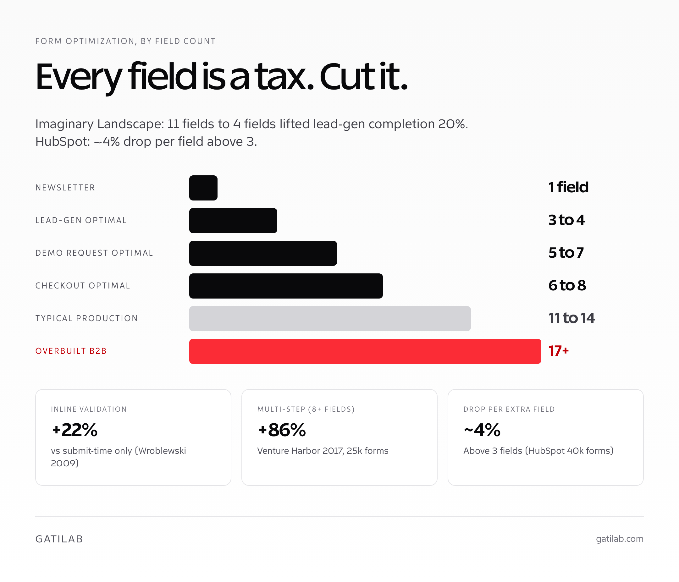
- Too many fields. The first cause of form abandonment in every published study. Optimal lead-gen form: 3 to 4 fields. Optimal checkout: 6 to 8 fields. Most production forms ship with 8 to 14.
- Required fields disguised as optional. The asterisk that nobody sees. Mark required fields explicitly; better, mark optional fields and make required the default.
- Validation only on submit. The visitor fills out 10 fields, hits submit, and gets a wall of red errors. Inline validation cuts abandonment 22 percent in Baymard’s quantitative tests; submit-time-only validation is the worst pattern still in production.
- Mobile keyboard mismatches. Email field with a regular keyboard. Phone field that triggers caps lock. Postal code with the wrong numeric pad. Each one costs about 1 to 3 percent.
- Autocomplete disabled. Either the autocomplete attribute is missing or set to “off” deliberately. Browser autofill is the single largest UX win on long forms; disabling it is a self-inflicted wound.
- Confusing error copy. “Invalid input.” Invalid how? “Please enter a valid phone number” tells the visitor nothing. Errors should describe the rule the input broke and how to fix it.
The MarketingExperiments dataset, the Baymard quantitative checkout studies, the Nielsen Norman group form usability work from 2008 onward, and every internal client benchmark I’ve collected since 2018 all converge on the same point: form length matters more than form design. A short ugly form converts better than a long pretty one almost every time.
Field Count: The Single Biggest Variable
Field count is the single largest determinant of form completion rate. The data is consistent across studies, industries, and form types. The HubSpot 2018 analysis of 40,000 landing page forms found completion rate dropped roughly 4 percent for every additional field above 3. The Imaginary Landscape lead-form study showed a 20 percent lift moving from 11 fields to 4. The Quicksprout consolidated data put the optimal lead-gen form at 3 to 5 fields, and the optimal demo-request form at 7 fields max.
| Form type | Optimal field count | Typical production count | Cut targets |
|---|---|---|---|
| Newsletter signup | 1 (email only) | 2 to 4 | Name, country, “interests” multi-select |
| Lead-gen / content download | 3 to 4 | 7 to 11 | Phone (unless sales-led), company size, industry, job title |
| Demo request (B2B) | 5 to 7 | 9 to 14 | Company size (default to lookup), industry, “how did you hear” |
| Ecommerce checkout | 6 to 8 | 11 to 14 | Phone, company name, address line 2, separate billing |
| Account creation | 3 (email, password, optional name) | 6 to 8 | Username (use email), confirm password, security questions |
| Contact form | 3 (name, email, message) | 5 to 7 | Subject (use AI routing), department, urgency |
The argument against cutting fields is always the same: “but sales needs that data.” The counter-argument is consistent too: sales gets nothing if the visitor never submits the form. Move the data collection that isn’t strictly necessary for the form’s primary action to a post-submission step, an enrichment service like Clearbit or RB2B, or a follow-up email. The 11-field form that converts at 8 percent loses to the 4-field form that converts at 24 percent on every objective metric.
Multi-Step Forms: When They Actually Win
Multi-step forms (also called progressive forms or wizard forms) split a long form across two or more screens with progress indicators. The Venture Harbor 2017 study of 25,000 form submissions found multi-step forms converted 86 percent better than single-step on identical questions. The number is real, but it’s misleading without context. The lift comes from two specific psychological mechanisms, and if neither applies, the multi-step approach can perform worse than a clean single-step form.
- Sunk-cost commitment. Once a visitor answers two questions, they’re more likely to answer two more. Multi-step forms exploit this by putting easy questions first and harder questions later.
- Progress visibility. A “Step 2 of 4” indicator reduces uncertainty and forecasts effort. Single long forms hide the total scope; multi-step shows it.
- Pick multi-step when: the form is genuinely long (8 plus fields), the questions vary in difficulty, you want to capture partial submissions for retargeting (email on step 1, rest later), or you’re using the answers to qualify or route the lead.
- Pick single-step when: the form is short (4 or fewer fields), the audience is technical and impatient, or you’re worried about JavaScript-disabled accessibility.
The hidden win of multi-step forms is partial-submission capture. Most multi-step tools (Typeform, Tally, HubSpot Forms, Formless) save the submission as the user progresses. If the visitor drops at step 3 of 5, you have their first three answers, including email if you placed it in step 1. That partial data feeds an automated nurture sequence that recovers a percentage of drop-offs the single-step form never would.
Smart Defaults and Inline Validation
Smart defaults are the cheapest form fixes available. Pre-select the country based on the visitor’s IP geolocation. Default the billing address to the shipping address. Auto-format phone numbers as the user types. Default the date picker to today’s date plus the most likely offset (e.g., next Tuesday for a B2B demo). Each of these saves the visitor a tap or a thought, and over a 6-field form, that compounds.
Inline validation is the second cheapest. Show error messages as the visitor leaves a field, not after they hit submit. The Luke Wroblewski 2009 inline validation study (still the gold standard reference) showed a 22 percent completion rate lift on identical forms. The mechanism is straightforward: catching the typo at field exit gives the visitor immediate feedback while the context is fresh; catching it at submit time forces re-orientation and increases abandonment.
- Validate on blur, not on keystroke. Real-time validation as the user types is too aggressive; let them finish the input first.
- Show success states, not just errors. A green checkmark next to a correctly filled field reduces uncertainty about whether you’ll accept the input.
- Write error messages that describe the fix. “Please enter an email address (e.g., name@company.com)” beats “Invalid email.”
- Validate format and existence separately. An email can be syntactically valid but not deliverable. For high-stakes forms, use Hunter, Kickbox, or NeverBounce to verify deliverability before submit.
- Don’t validate fields the visitor hasn’t touched. Showing errors on empty required fields before submit is hostile UX.
The autofill layer compounds with inline validation. Set autocomplete attributes on every field (given-name, family-name, email, tel, street-address, postal-code, etc.). Use the right type and inputmode values so mobile keyboards switch correctly. The combined effect on a 6-field form is roughly 8 to 15 seconds saved per visitor and a 4 to 9 percent completion-rate lift.
Mobile Form Optimization
Mobile forms are where most desktop-optimized forms quietly die. The viewport is smaller, the keyboard takes half the screen, and every tap is harder than a click. Forms that perform fine at 1440 pixels can lose 30 to 50 percent of mobile completions if they weren’t built for the smaller surface. The mobile-specific wins compound on top of everything else.
- Stack labels above fields, not beside them. Label-on-the-left layouts force the field into a narrow column; stacked layouts use the full width.
- Use floating labels carefully. They look elegant but can hurt accessibility and screen-reader handling. Test them; don’t ship them by default.
- Make tap targets at least 44 by 44 pixels. Apple’s HIG minimum and the WCAG 2.5.5 target size guideline. Smaller targets cause mis-taps that compound over a multi-field form.
- Keep the submit button visible. If the keyboard covers the submit button, mobile completion drops measurably. Sticky-bottom submit buttons or “next field” submit-on-keyboard are the patterns that hold up.
- Don’t disable zoom. Some form CSS sets
maximum-scale=1on the viewport meta tag. This breaks accessibility for low-vision users and is a soft penalty in Google’s mobile usability scoring. - Test on a real device. Browser DevTools mobile emulation is not the same as a 5.5-inch screen with one-handed thumb reach. Always test the actual flow on a phone before shipping.
On WordPress, Core Forms gives you visual fields or HTML markup, conditional fields, and a submissions inbox. Use that control to implement the form changes, then measure the result on your own page; the plugin itself does not establish a conversion lift.
The single largest mobile-specific lift I’ve shipped on forms came from cutting the visible field count to 3 on the first screen, then progressively disclosing the rest. The form length didn’t change; the perceived effort did. Mobile completion lifted 31 percent in 9 days. Desktop completion was unchanged. The lesson generalizes: mobile and desktop are different surfaces with different optimization paths, and the best forms test them separately.
If your form lives inside a checkout flow, the form patterns here apply but the recovery economics shift. Checkout abandonment costs you the order; lead-form abandonment costs you the contact. Both matter; the priority depends on funnel stage.
Where Visitors Abandon WordPress Forms
You should measure the gap between a form being shown, someone starting it and a submission completing before deciding which fields to remove. A required field may be necessary for the service, while an unclear error can stop people who were willing to answer it.
Core Forms is our WordPress form plugin. Its analytics include views, starts, completions and field drop-off, making it an option when you want to examine the form within WordPress. Check which tracking is enabled and how your privacy choices affect the recorded totals.
Use matching definitions when comparing results. For a hypothetical set of 200 recorded starts and 80 completions, completion among starters is 40%. That says nothing by itself about the percentage of all page visitors who completed the form; the denominator is different.
You can record the following for one form:
- The page and form identifier.
- Recorded views, starts and completions over the same period.
- Fields where people stop or encounter errors.
- Device type when available without collecting unnecessary personal information.
- The change being evaluated.
- Whether successful submissions produced useful inquiries.
A field-level drop-off is a clue, not proof that the field caused abandonment. Someone may leave while looking up an answer, lose connectivity or decide the service is unsuitable. Inspect the wording and required format before drawing the conclusion.
For example, a budget field may help qualify an inquiry. Removing it could increase completions while adding unsuitable leads. A clearer set of ranges and an honest “not sure yet” option may be a better experiment than deleting it.
Make one consequential change and compare like-for-like periods or use a properly configured experiment. Keep changes in traffic source and the offer itself in mind; they can alter completion rates independently of the form.
If your current form tool doesn’t expose the observations you need, review Core Forms against that requirement. The useful outcome is a form that completes reliably and gives your team information it can act on, rather than a higher percentage detached from lead quality.
Form Analytics Tools (Hotjar, Zuko, Formisimo)
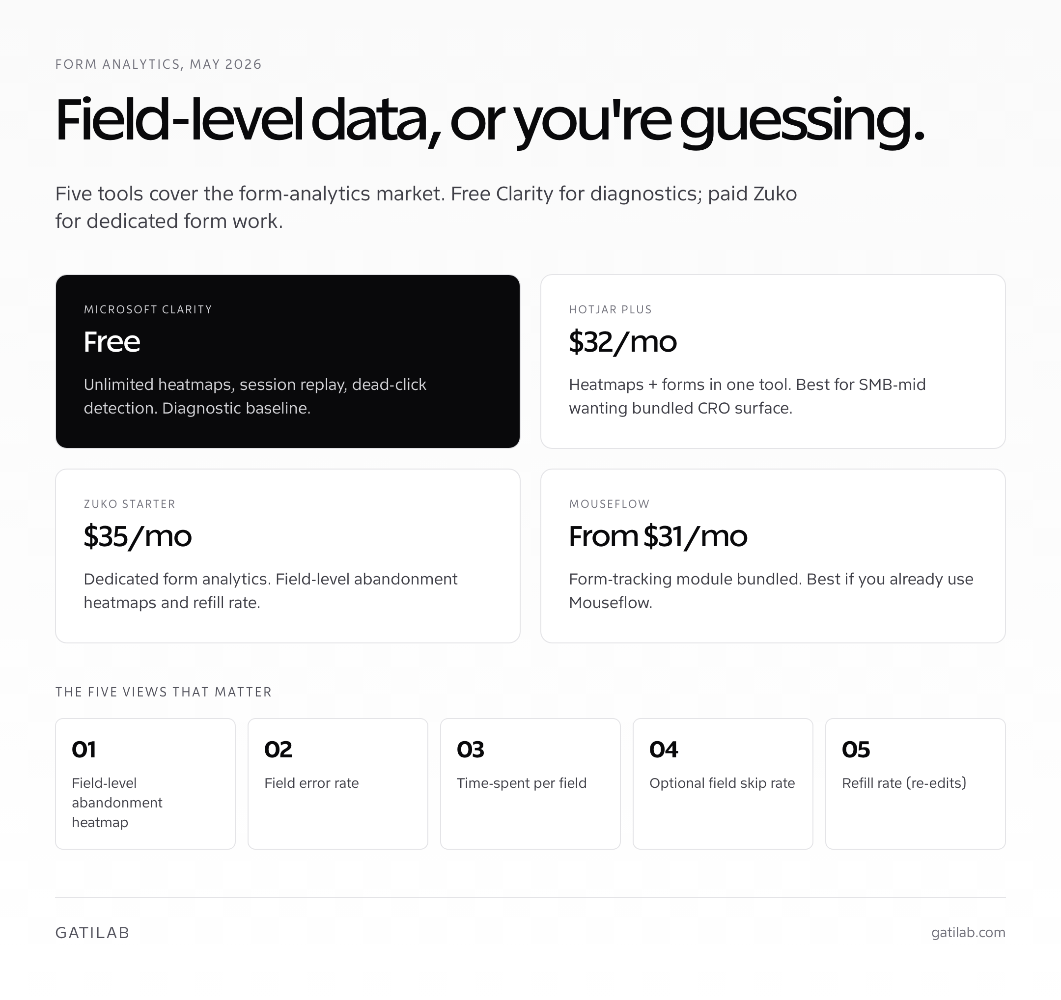
Form analytics tools track field-level behavior: which fields users skip, which fields trigger errors, which fields take the longest, which fields cause abandonment. Without form analytics, form optimization is guessing. With it, the leaks become obvious within a single 200-session window. Three tools dominate the form-analytics market in 2026, with overlapping but distinct strengths.
| Tool | Pricing (May 2026) | Best for | Setup |
|---|---|---|---|
| Hotjar Plus | $32/mo (annual) | SMB to mid-market wanting heatmaps + forms in one tool | Snippet install, 10 minutes |
| Zuko (formerly Formisimo Insights) | $35/mo (Starter), $79/mo (Pro) | Form-focused programs, dedicated form analytics | Snippet + form selector, 30 minutes |
| Formisimo (legacy / enterprise) | Quote-only (~$200+/mo) | Enterprise checkout analytics, custom integrations | Engineering setup, 1 to 3 days |
| Microsoft Clarity | Free (unlimited) | Diagnostic baseline, session replay, dead-click detection | Snippet install, 5 minutes |
| Mouseflow Form Analytics | Bundled (Mouseflow plans from $31/mo) | Mouseflow customers wanting form layer | Form-tracking module, 20 minutes |
For most teams, the right starting stack is Microsoft Clarity (free, for the heatmap and session-replay layer) plus Zuko at $35/month (for the dedicated form analytics). Hotjar Plus combines both layers into one tool and is the better pick if you’re already running it for heatmaps. Formisimo’s enterprise tier is overkill below $5M annual revenue.
- Field-level abandonment heatmap. Which field is the last one the user touched before leaving. The single highest-value form analytics view.
- Field error rate. Which fields produce the most validation errors. High-error fields are usually badly worded or badly typed.
- Field time-spent. A field taking 9 seconds is signaling confusion. A field taking 2 seconds is performing as expected.
- Skip rate (for optional fields). If 80 percent of users skip an optional field, it’s not pulling its weight; cut it.
- Refill rate. Users editing the same field repeatedly. Often signals an unclear validation rule (e.g., password requirements not visible).
For the broader analytics and CRO toolchain, my CRO tools roundup covers the layers around form analytics: heatmaps, session replay, A/B testing, surveys, and personalization. Form analytics is one slot in a six-category stack; treat it as such.
A/B Testing Forms
A/B testing forms is one of the highest-confidence experimentation surfaces in CRO because the conversion event is the form submission itself, the funnel is short, and the sample sizes accumulate fast on most pages. The tests that consistently produce wins on instrumented forms: field count (cut 2 to 4 fields), label placement (top vs left vs floating), button copy (“Get my report” vs “Submit”), and single-step vs multi-step on the same questions.
- Test field count first. Cut the lowest-skip-rate-justified field and re-measure. The lift is usually large enough to call within a week on most forms.
- Test single-step vs multi-step. On forms with 6 plus fields, the multi-step variant often wins by 15 to 30 percent. On forms with 4 or fewer, single-step usually wins.
- Test button copy. Action-oriented copy (“Get my free audit”) consistently outperforms generic copy (“Submit”). The button is the last decision the visitor makes; the words matter.
- Test label placement. Top-aligned labels typically win on mobile; left-aligned can win on desktop for very short forms (1 to 3 fields). Floating labels test mixed.
- Skip the design micro-tests. Button color, border radius, font weight rarely move the metric meaningfully. Spend test cycles on field count and structure instead.
For the experimentation tooling, my A/B testing tools writeup covers picks by team and stage. Most form-level testing can be done with VWO, Convert, AB Tasty, or GrowthBook depending on whether marketing or engineering owns the form. Many form builders (Typeform, HubSpot Forms, Tally) include native A/B testing for variants without needing a dedicated experimentation platform.
Common Form Optimization Mistakes
The mistakes I see in client form audits cluster as predictably as the checkout and popup mistakes. Almost every underperforming form makes three or more of these. Fixing them is rarely a redesign; it’s a sequence of 30-minute changes shipped in the right order.
- Asking for the phone number on a content download form. The visitor wanted a PDF, not a sales call. Phone fields on top-of-funnel forms cost 6 to 14 percent of completions for almost no incremental sales value.
- Disabling autocomplete deliberately. Some teams add
autocomplete="off"for “security.” Browsers ignore it for password managers and the user experience is worse for everyone. - Validating on every keystroke. Showing red errors as the user is still typing is hostile. Validate on blur (when they leave the field) instead.
- Hidden password rules. “Password must contain a special character” surfaced only after the user submits an invalid one. Show the rules upfront and check them inline.
- CAPTCHA on every form. Cloudflare Turnstile and Google’s reCAPTCHA v3 are nearly invisible. Old-school checkbox CAPTCHAs add 4 to 11 percent abandonment for marginal spam protection.
- Generic error messages. “An error occurred.” Which error? Tell the user what to do. Specific errors recover; generic errors abandon.
- No “thank you” page. Submitting a form that returns to the same page is jarring. Always confirm the submission and tell the user what happens next.
The single largest mistake is treating forms as a static surface. Forms perform differently across audiences, stages, devices, and seasons. The form that converted at 18 percent in Q1 might convert at 12 percent in Q4 if your traffic mix shifted. Re-audit forms quarterly with the form analytics tool you’ve already deployed; the leaks shift over time and the lift is sitting there for whoever notices first.
If your form lives on a page that hasn’t been audited for general conversion blockers, my website audit guide covers the page-level work that should ship before form optimization. Most teams find the page is the leak; the form is downstream.
A 14-Day Form Optimization Sprint
Form optimization compounds quickly because the cycle time per change is short and the measurement loop is tight. If you’re starting on a form that hasn’t been touched in months, here’s the sprint plan I run for clients. The pattern compounds: each fix unlocks measurement clarity for the next.
- Days 1 to 3: Instrument. Install Microsoft Clarity (free) for session replay. Install Zuko or Hotjar Plus for field-level form analytics. Let it collect 200 to 500 sessions before drawing conclusions.
- Days 4 to 6: Diagnose. Identify the top 3 fields by abandonment, error rate, or time-spent. Cross-reference with the session replays. The leak is usually obvious by the second viewing.
- Days 7 to 9: Quick wins. Cut 2 to 3 fields you can defend cutting. Set autocomplete attributes on every remaining field. Switch validation from submit-time to blur-time. Add specific error messages.
- Days 10 to 12: A/B test. Pick the highest-leverage hypothesis (usually field count or single-step vs multi-step). Ship the variant. Run for at least one full business cycle.
- Days 13 to 14: Mobile audit. Test the form on a real phone, one-handed. Check tap targets, keyboard switching, sticky submit visibility. Fix the obvious mobile-specific issues.
Most forms I run this for see a 15 to 35 percent completion rate lift in the 14-day window, with the bulk of the lift coming from the field-count work and the inline-validation switch. Mobile-specific work usually contributes another 5 to 12 percent on top, depending on how badly the original form ignored mobile.
If your forms feed into an exit-intent recovery layer, my exit-intent popups guide covers the popup configuration that recovers form abandoners specifically. The combination of optimized form plus targeted recovery popup typically lifts contact-capture rate 20 to 40 percent vs either alone.
FAQs on Form Optimization
What is form optimization?
Form optimization is the practice of reducing friction in any form (lead-gen, signup, checkout, contact, application) so more visitors complete it. The work covers field-count reduction, smart defaults, inline validation, error UX, mobile keyboard handling, autocomplete attributes, and A/B testing. The MarketingExperiments dataset shows roughly 11 percent average completion lift moving from 11 to 4 fields on lead-gen forms; Baymard’s checkout data shows similar patterns at the transactional end.
How many fields should a form have?
Optimal counts by form type: newsletter signup 1 field (email only), lead-gen or content download 3 to 4 fields, B2B demo request 5 to 7 fields, ecommerce checkout 6 to 8 fields, account creation 3 fields (email, password, optional name), contact form 3 fields (name, email, message). Most production forms ship with 8 to 14 fields. Cut fields you can’t defend: phone for content downloads, company size, industry, and any field with skip rate above 18 percent in form analytics.
Are multi-step forms better than single-step?
It depends on form length. The Venture Harbor 2017 study of 25,000 forms found multi-step converted 86 percent better than single-step on identical questions. The lift comes from sunk-cost commitment (once you answer two questions, you’re more likely to answer two more) and progress visibility. Multi-step wins on forms with 8 plus fields. Single-step wins on forms with 4 or fewer. Multi-step also captures partial submissions for retargeting if you place email in step 1.
What are the best form analytics tools?
Microsoft Clarity (free) for unlimited heatmaps, session replay, and dead-click detection as the diagnostic baseline. Hotjar Plus at $32 per month for SMB to mid-market wanting heatmaps and forms in one tool. Zuko Starter at $35 per month for dedicated form analytics with field-level abandonment heatmaps. Formisimo’s enterprise tier at quote-only pricing for $5M plus annual revenue stores. Mouseflow Form Analytics bundled with Mouseflow plans from $31 per month.
Why is inline validation important?
Inline validation shows error messages as the user leaves a field (on blur), not after submit. The Luke Wroblewski 2009 inline validation study showed a 22 percent completion-rate lift on identical forms versus submit-time-only validation. The mechanism: catching the typo at field exit gives immediate feedback while context is fresh; catching it at submit forces re-orientation and increases abandonment. Validate on blur, not on every keystroke (real-time validation is too aggressive).
How do I optimize forms for mobile?
Stack labels above fields (don’t put them beside fields). Make tap targets at least 44 by 44 pixels. Use the right input types (type=’email’, type=’tel’, inputmode=’numeric’) so mobile keyboards switch correctly. Set autocomplete attributes on every field. Keep the submit button visible above the keyboard with a sticky-bottom pattern. Don’t disable zoom (some form CSS sets maximum-scale=1, which breaks accessibility). Always test on a real device, not just DevTools emulation.
What’s the most common form optimization mistake?
Asking for the phone number on top-of-funnel forms. The visitor wanted a PDF, not a sales call. Phone fields on content-download forms cost 6 to 14 percent of completions for almost no incremental sales value. Other common mistakes: disabling autocomplete deliberately, validating on every keystroke instead of on blur, hiding password rules until after submit, using old-school checkbox CAPTCHAs (Cloudflare Turnstile and reCAPTCHA v3 are nearly invisible), and writing generic error messages like ‘Invalid input.’
How long does form optimization take to show results?
Most forms see 15 to 35 percent completion-rate lift in a 14-day sprint when the standard playbook ships in order: instrument with form analytics, diagnose the top 3 fields by abandonment and error rate, cut 2 to 3 indefensible fields, switch validation from submit-time to blur-time, add specific error messages, run a single A/B test on field count or single-step versus multi-step, and audit on a real mobile device. The cycle time is short and the measurement loop is tight.
Should I use floating labels on form fields?
Test them; don’t ship them by default. Floating labels look elegant but can hurt accessibility (some screen readers handle the label-as-placeholder pattern poorly) and add cognitive load on long forms because the label disappears once the field has content. Top-aligned labels typically win on mobile across most A/B tests. Left-aligned labels can win on desktop for very short forms (1 to 3 fields) where horizontal space is plentiful.
Can A/B testing forms produce significant lifts?
Yes. Form A/B tests are among the highest-confidence CRO experiments because the conversion event (submit) is the form itself, the funnel is short, and sample sizes accumulate fast. Tests that consistently produce wins: field count (cut 2 to 4 fields), single-step versus multi-step on 6 plus field forms, button copy (‘Get my free audit’ beats ‘Submit’), and label placement on mobile. Tests that rarely move the metric: button color, border radius, font weight. Skip design micro-tests; spend cycles on structure instead.
Tell Google you want more of this.
Add Gatilab as a preferred sourceOne tap, and this site shows up more often in your own Top Stories, AI Overviews and AI Mode. Remove it any time.