
Instagram Story Ads: Specs, Safe Zones, and Setup in Meta Ads Manager
Your Instagram Story ad is live, the vertical video looks right on your laptop, and the click-through rate is flat. Somewhere between the export and the phone screen, the headline you spent an hour positioning ended up sitting underneath a call-to-action button. Nothing in Ads Manager warned you, and the ad kept spending.
Most advertisers buying this placement land in one of two camps. The first exports the feed creative at 9:16, ships it, and treats Stories as a crop. The second over-produces, building a studio-grade spot with music cues and a slow logo reveal for a screen somebody is tapping through one-handed on a train.
The placement isn’t a canvas size. It’s a list of things that get covered.
Meta publishes the real numbers in its ads guide, and several of them differ from the specs that circulate in roundups. This is what the documentation says, where the popular figures drift, and the full path from a blank campaign to a live Story ad.
Story ads are built in Ads Manager, not the Instagram app
Instagram Story ads are full-screen vertical ads that appear between the Stories people tap through. They can be a single image, a single video, or a carousel, and each carries a call-to-action button pointing at a site, an app, or a profile. What catches people out is where they get made. Not in the Instagram app, but in Meta Ads Manager, the same console that runs Facebook campaigns.
That’s why the format answers to two names. “Instagram Story ads” and “Facebook ads on Instagram Stories” describe one workflow with the placement set to Instagram Stories.
Same tool. Different checkbox.
Meta’s published specs, and where the popular numbers drift
Almost every spec roundup lists Instagram Story ads at 1080 by 1920 pixels. Meta’s ads guide for the Stories placement recommends 1440 by 2560. Both are 9:16, and Meta accepts a 1% tolerance on the ratio, so a 1080-wide file runs fine. It just isn’t the resolution the documentation asks for.
| Spec | Video ad | Image ad |
|---|---|---|
| Aspect ratio | 9:16, 1% tolerance | 9:16, 1% tolerance |
| Recommended resolution | 1440 x 2560 | 1440 x 2560 |
| File types | MP4, MOV, GIF | JPG, PNG |
| Maximum file size | 4 GB | 30 MB |
| Minimum width | 250 px | 500 px |
| Duration | 1 second to 60 minutes | Displays 5 to 16 seconds, or until a swipe |
| Primary text | 125 characters | 125 characters |
Two rows there contradict the folk wisdom outright. There is no 15-second ceiling on a Stories video ad, and Meta asks for considerably more pixels than the figure everyone repeats.
The encoding recommendation is worth keeping somewhere you can reach it:
H.264 compression, square pixels, fixed frame rate, progressive scan, and stereo AAC audio at 128 kbps or higher.
Build that into an export preset once and render time stops being a guessing game. It also removes the most boring failure mode in this placement, which is an ad rejected for a container problem that has nothing to do with the creative.
The safe zone is larger than most guides admit
This is where the circulating specs do the most damage. For single image and single video ads in Stories, Meta’s guidance is to leave roughly 14% of the top, 35% of the bottom, and 6% of each side free of text, logos, and other key creative elements.
Plenty of guides quote 250 pixels at the top and 340 at the bottom instead. Those numbers are real, but they belong to the carousel spec, where Meta lists 14% top and 20% bottom. For a single image or video, the bottom band is closer to double that.
Run Meta’s percentages against a 1080 by 1920 canvas and the arithmetic is unforgiving:
- Top band lost to the profile icon and progress bar: about 269 pixels.
- Bottom band lost to the reply bar and call-to-action button: about 672 pixels.
- Each side: about 65 pixels.
- What’s genuinely safe: a region roughly 950 pixels wide by 979 tall, sitting a little above center.
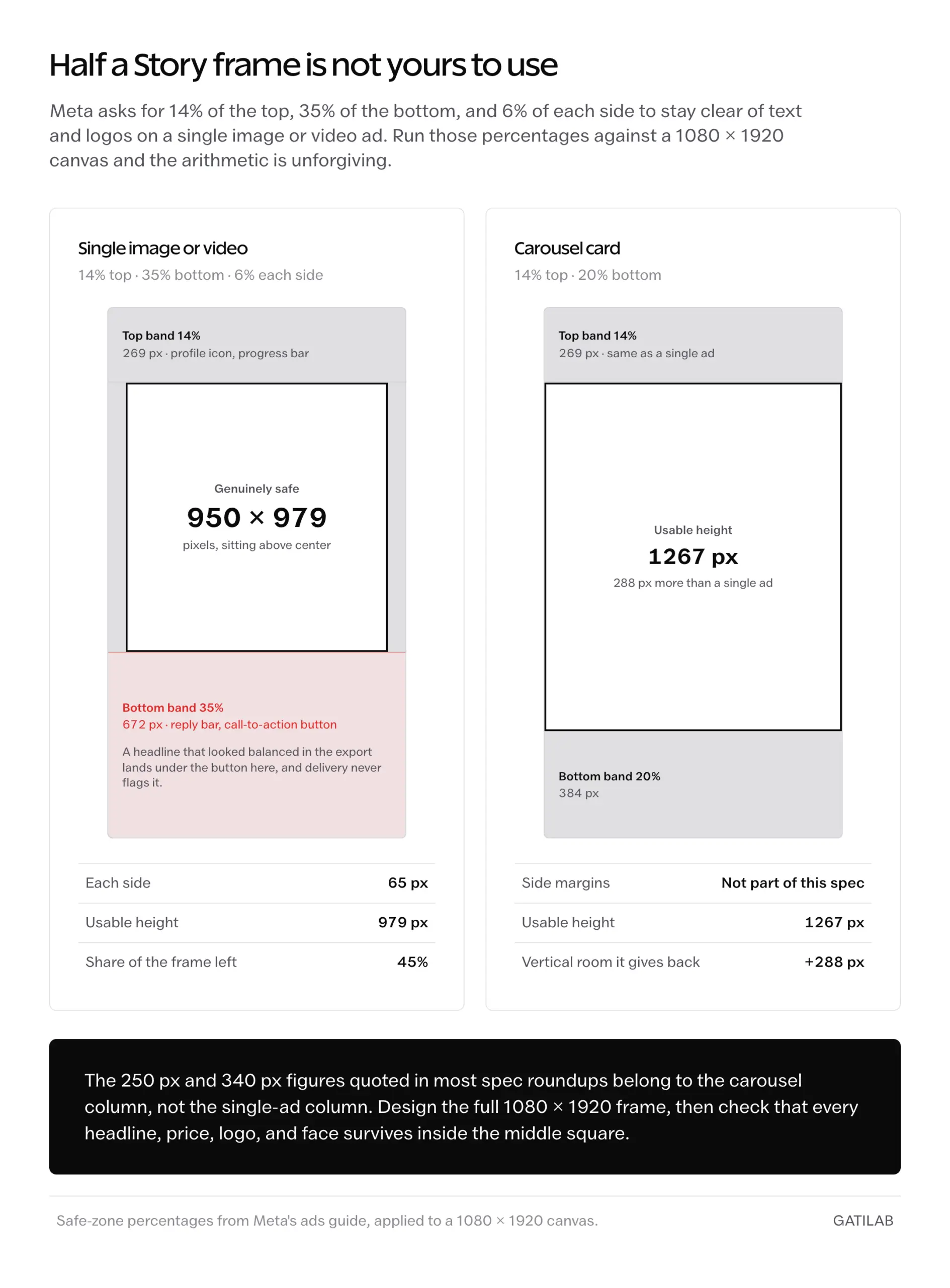
That’s close to a square floating in the middle of a tall rectangle. Design the full 1080 by 1920 frame, then check that every headline, price, logo, and face survives inside that middle square. Everything outside it is background that may or may not be visible.
Assume the bottom third is gone.
The 15-second rule is a display rule, not a limit
Meta’s technical requirement for a Stories video ad runs from 1 second to 60 minutes. The 15-second figure that gets quoted as a hard cap is describing something else entirely: how Instagram chops a longer video into pieces.
The number does have a real origin. When Instagram started selling skippable ads between Stories in January 2017, the slots were fixed at 5 seconds for a photo and 15 seconds for a video. That launch specification is the ancestor of nearly every “15 seconds maximum” line still circulating, about 9 years later. It describes a product that has since been rebuilt around a much larger video surface.
- Video ads shorter than 35 seconds play for their full duration in the Stories placement.
- Video ads of 15 seconds or longer may be split into separate Stories cards.
- Instagram shows 1, 2, or 3 cards automatically, then offers a “Keep watching” tap for the remainder.
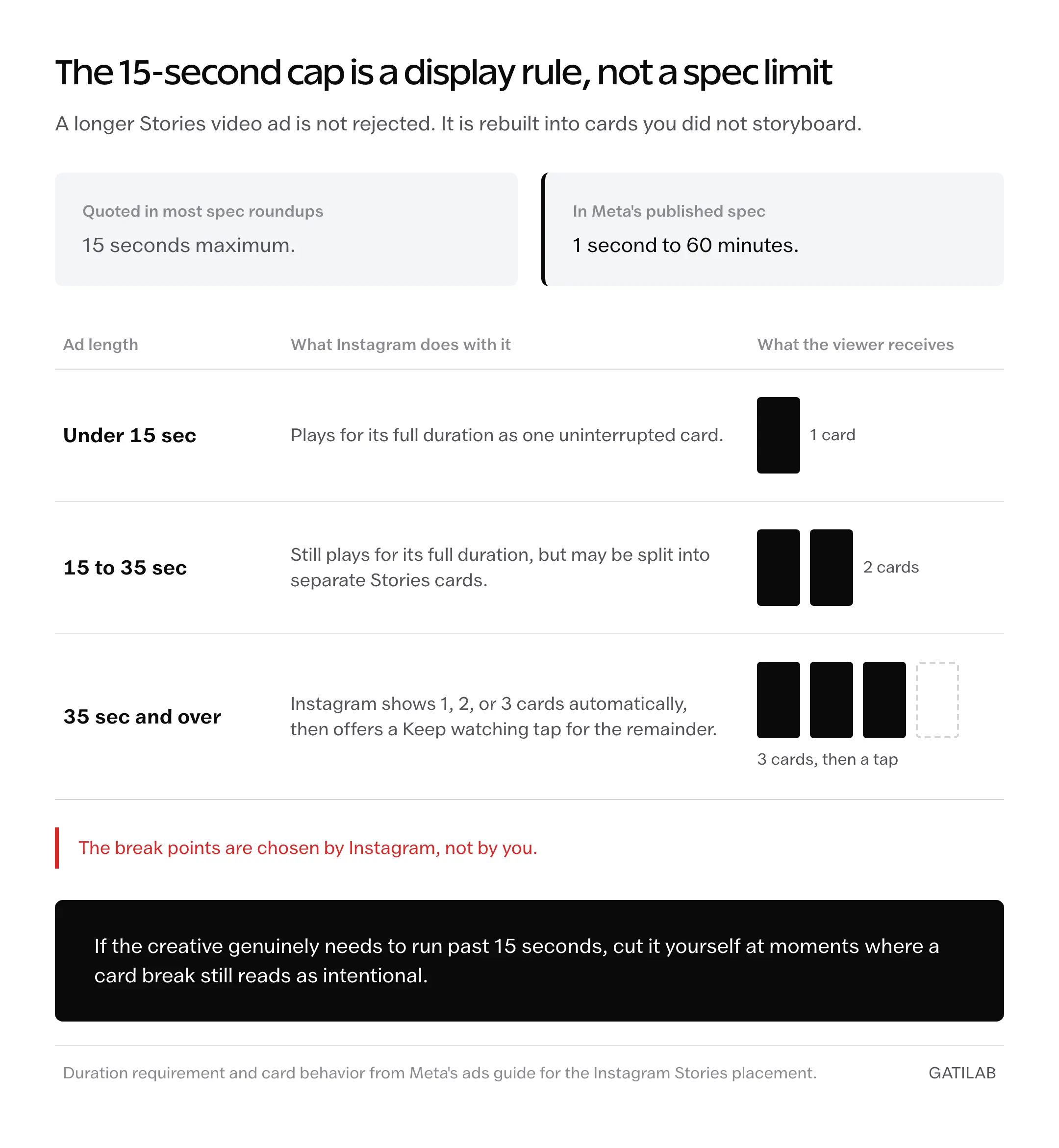
So a 30-second ad isn’t rejected. It gets rebuilt into cards you didn’t storyboard, with breaks chosen by Instagram rather than by you. If the creative genuinely needs to run past 15 seconds, cut it at moments where a card break still reads as intentional.
Cut it yourself.
Building the campaign, step by step
Once the creative exists, the console work is short. The sequence below is the whole path from an empty campaign to a live Story ad.
- Create the campaign. Pick the objective that matches the outcome you’re buying: awareness, traffic, engagement, leads, app promotion, or sales.
- Set up the ad set. Budget, schedule, and audience. This is where a clear definition of who you’re trying to reach saves more money than any creative decision downstream.
- Switch to Manual placements. Advantage+ placements is the default and spreads delivery across Meta’s surfaces. To run Stories specifically, choose Manual placements, select Instagram, and check Stories.
- Upload the creative built to the specs above, with the key elements inside the safe area.
- Write the copy. 125 characters of primary text, a headline, a call-to-action button, and the destination URL. If the ad points at your profile rather than a product page, your link in bio becomes the actual conversion step.
- Preview in the Stories placement before publishing, and confirm nothing important is sitting in the covered bands.
Step 3 is the one people skip. Leave Advantage+ placements switched on while calling this a Story ad campaign, and Meta will serve the file wherever delivery looks cheapest, including feed slots where a 9:16 video gets letterboxed. The reporting then blends placements together, which quietly makes the campaign unreadable.
Turn it off.
What separates a Story ad that converts
Specs get the ad on screen intact. The opening seconds decide whether anyone stays. The difference usually shows up in frame 1.
What most Story ads open with:
A logo animation, then a product on a white background, then a headline arriving around the 4-second mark.
What works better:
A hand, a face, or the product already moving in frame 1, with the offer as burned-in text by second 2.
Same product, same budget, same 125 characters. The second version earns the second second, which is the only currency this placement trades in. A viewer leaves by tapping, not by scrolling past, so there’s no partial exposure to fall back on.
Frame 1 decides.
One more design constraint deserves naming. Meta’s spec sheet lists captions and sound as optional but recommended, which is the platform’s own signal that plenty of playback happens silently. Treat burned-in text as the message rather than a subtitle track, and the ad still argues when the phone is muted.
What Story ads cost, and what moves the number
There’s no rate card. You set a budget, an auction sets the price, and what you pay per result moves with three things.
- The audience you’re bidding against. A narrow, commercially valuable segment in a competitive market costs more per impression than a broad one.
- The objective. A purchase costs more than an impression, because you’re asking for a harder action and the system optimizes toward people likely to take it.
- Creative quality. Engagement signals feed back into the auction, so a weak ad doesn’t just underperform, it gets more expensive to keep running.
Benchmarks are worth reading as a range rather than a forecast. Gatilab’s breakdown of Facebook advertising costs covers the CPM, CPC, and CPA bands in detail, and the same auction prices Instagram placements. For modeling impression costs before you commit a budget, a CPM calculator gets you closer than a blended industry average will.
Start small.
Story ads compared with boosting from the app
Boosting is the promote button inside Instagram. A Story ad is a campaign in Ads Manager. Both buy distribution through the same auction, but the control you get is not comparable, and confusing the two is an expensive way to learn the difference.
Boosting hands you a narrow slice: limited targeting, a short objective list, and little say over where the content runs. A campaign gives you the full objective set, manual placement control, audience construction, and a preview of the rendered placement before any money moves. That last one matters more than it sounds, because it’s the only chance to catch a buried headline before it costs you a flight.
Use boosting when the goal is a fast visibility push on something already performing. Build the campaign when the ad has to convert, scale, or be compared against another version.
Image, video, or carousel
Three creative formats run in this placement, and they aren’t interchangeable. Pick by what the message needs, not by what’s fastest to produce.
- Single image. Displays for 5 to 16 seconds or until a swipe, JPG or PNG, 30 MB ceiling. Suits one clear offer where the message reads instantly.
- Single video. The format the placement was designed around. Motion holds a frame that a static image has to earn some other way.
- Carousel. Multiple cards a viewer taps through, useful for a sequence of products or steps. Worth knowing: Meta lists a different safe zone here, 14% top and 20% bottom, so a carousel card has meaningfully more usable vertical room than a single video.
That carousel exception is also where the widely quoted 250 and 340 pixel figures came from originally. They were never wrong, just attached to the wrong format on the way around the internet.
What Story ads will not fix
The placement is good at buying attention. It’s indifferent to nearly everything that happens afterward, and a few of its blind spots are worth knowing before you build a plan around it.
- A destination that doesn’t convert. The ad controls the tap, not what follows it. On a slow mobile landing page, a stronger hook just buys more expensive bounces.
- Fatigue in a small audience. Story creative wears out, and a narrow audience sees the same card repeatedly, so cost per result climbs while nothing about the ad has changed.
- Diagnosing which second lost the viewer. Reporting gives plays and completions, not the frame where attention dropped. Finding the weak beat means running variants, not reading a heatmap.
- Device-perfect previews. The Ads Manager preview renders the placement, not every handset’s notch, status bar, and reply-bar height. That’s precisely why the safe zone is a generous margin rather than an exact measurement.
None of these are reasons to skip the placement. They’re the reasons a Story ad belongs inside a content plan with a refresh cadence rather than being treated as a launch you can set and leave.
What quietly wastes Story ad budget
The obvious mistakes get caught in review. These don’t, because the campaign keeps running and nothing reports an error.
Exporting the feed cut at 9:16 and calling it a Story ad. It reads as a resize because it is one, and an audience fluent in this format spots it inside a frame. You pay full auction price for creative that announces itself as recycled.
Placing the headline near the bottom. It looks balanced in the export and lands under the call-to-action button on a phone. Delivery continues normally, so nothing flags as broken, and the flight finishes without the sentence that was supposed to do the selling.
Running a single creative and calling it a test. When results slide, there’s no way to tell whether the hook died or the audience did, and resolving that ambiguity costs a second flight you’d budgeted for scaling.
Leaving Advantage+ placements on for a campaign you intend to judge as Stories. Delivery drifts toward whatever is cheapest, the reporting blends surfaces, and the conclusion drawn at the end was never actually measured against the placement in question.
Treating captions as an accessibility checkbox rather than the argument. An ad whose case lives in a voiceover simply doesn’t make one when the phone is muted, and the spend continues either way.
The placement rewards restraint
Story ads rarely fail because an advertiser couldn’t make video. They fail because a phone screen has far less usable room than the export dialog implies, and most spec sheets in circulation understate how much of it Instagram takes back for its own interface.
The trade is real and worth stating plainly. Designing for a square in the middle of a 9:16 frame costs you the wide, cinematic composition you probably wanted, and vertical-native creative rarely repurposes cleanly into anything else. What it buys back is an ad whose message survives contact with the device it was made for.
Build the next one to Meta’s numbers, not the ones you’ve been quoting.
Tell Google you want more of this.
Add Gatilab as a preferred sourceOne tap, and this site shows up more often in your own Top Stories, AI Overviews and AI Mode. Remove it any time.