
B2B Landing Page Examples
A B2B page can look polished and still ask the visitor for the wrong commitment. Someone who only wants to understand the product gets pushed into a sales call before they’ve decided it fits, and they leave.
Useful B2B landing page examples match the next action to the visitor’s readiness. I would study what a page promises and what it asks in return before borrowing its layout. The 3 examples below cover a self-service product entry, a guided demo and a sales conversation, and each one does a different job well.
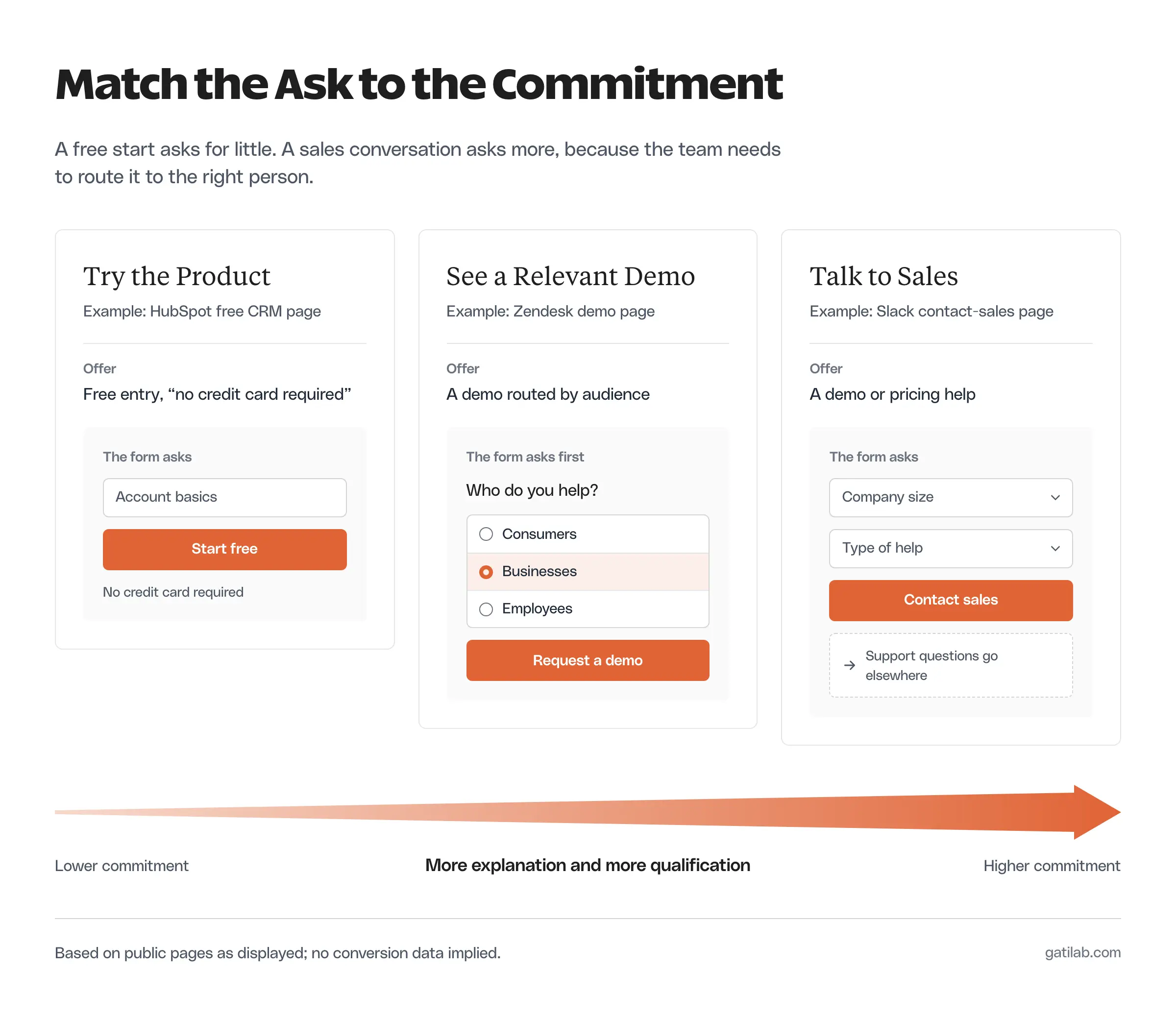
What to Compare
A landing page should explain enough for the visitor to understand the next action, and the amount of explanation depends on how big that action is.
These are the things worth comparing:
- The problem or use case the page names.
- The offer the visitor receives.
- The evidence that supports that offer.
- The commitment the page asks for.
- The information the form collects.
- What the visitor can expect after acting.
Compare pages that do similar jobs. A free-product signup and an enterprise sales form both support acquisition, but you can’t judge their form lengths against the same standard.
The visible design doesn’t tell you conversion performance either. A page can demonstrate a clear pattern without giving anyone access to its traffic quality or results, so treat these as patterns to study.
B2B Landing Page Examples
These examples use the public pages as they were displayed when this guide was written. Slack and Zendesk served their India-localized versions, so wording and form fields may differ in your region.
HubSpot
HubSpot’s CRM page is a product-entry page for startups and small businesses. Its main call to action is “Get free CRM,” with “No credit card required” right underneath.
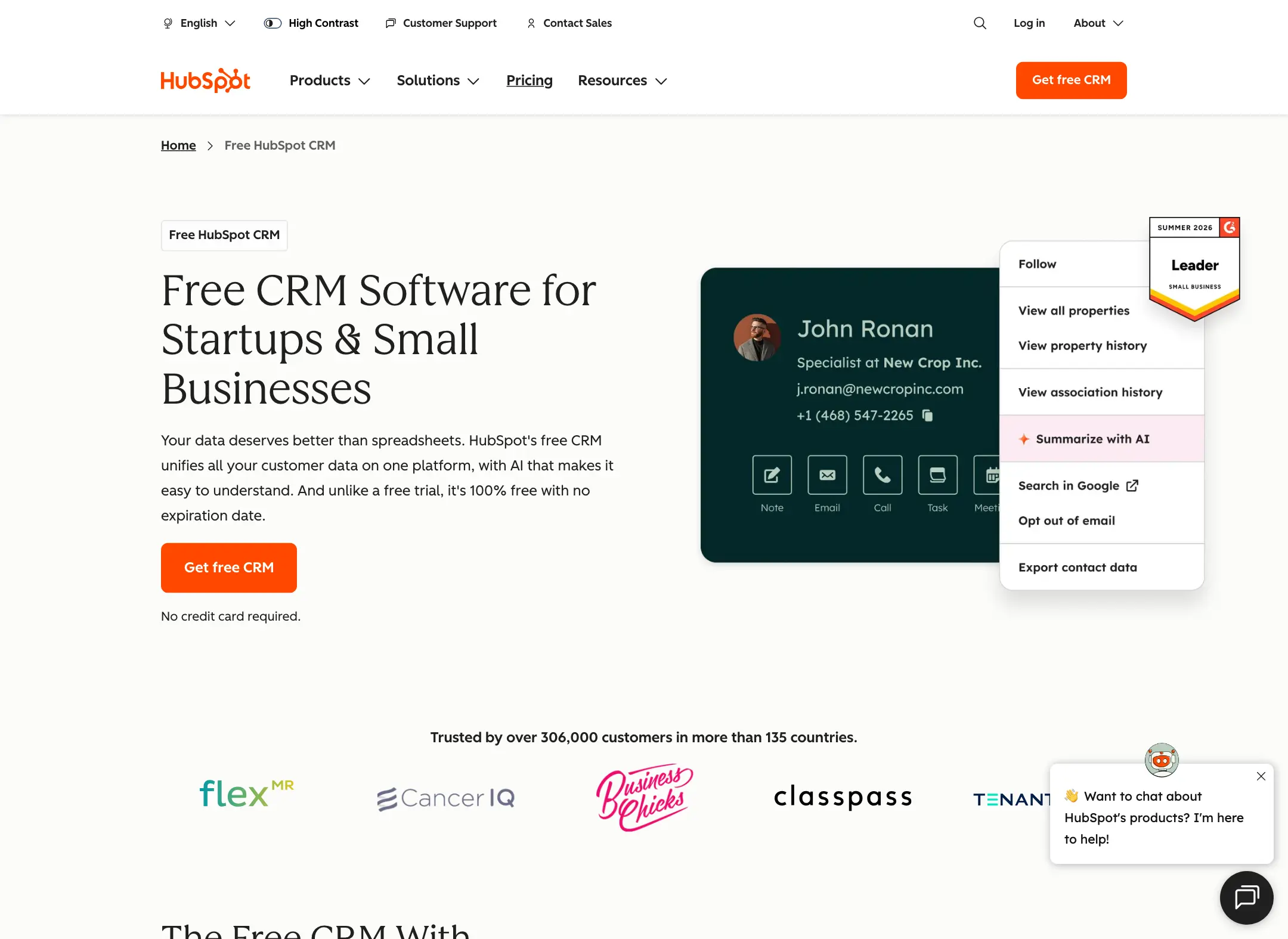
The pattern worth borrowing is how tightly the audience, the entry offer and the action fit together. The product visual gives the visitor something concrete to inspect instead of leaving the explanation abstract.
You can apply that structure to a self-service product or a usable resource:
- Name the reader who benefits.
- Explain the immediate purpose.
- Show enough of the product or output to orient them.
- Describe the first commitment accurately.
A free-entry message doesn’t settle every later pricing question. If your product needs paid features to deliver the promised outcome, say so near the claim. Borrowing a low-friction headline while the real experience needs an undisclosed purchase is how you lose trust right after the signup.
If you want to see what happens after that first click, signing up for the free HubSpot CRM shows the onboarding that follows the page’s promise.
Slack
Slack’s contact-sales page is built for a conversation. It explains that sales can help with a demo or pricing and sends technical-support questions somewhere else.
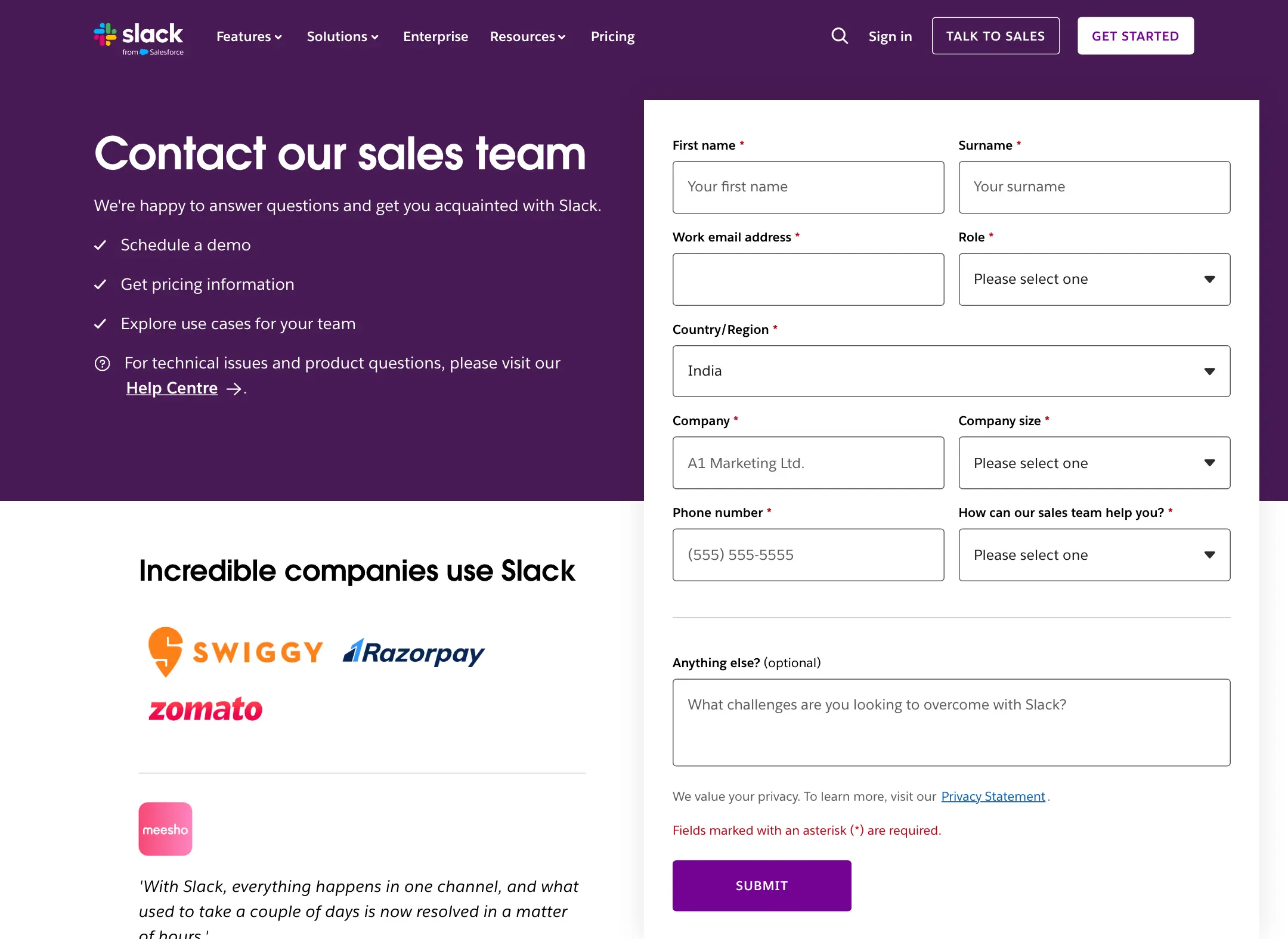
The form asks for business context, including company size and the kind of help needed. Those questions fit a sales-routing job far better than they would fit a resource download.
Marty Kausas, CEO of Pylon, defends the sales conversation for a product that needs migration and implementation work:
This is a two-way street. We dedicate a lot of resources to our customers across the sales conversation, migration, implementation, and ongoing support. We’re happy to do this, as long as we’re working with serious long-term partners.
Marty Kausas on X, July 7, 2026
That reasoning holds when the product genuinely needs that work, and the form’s questions should then reflect it.
The pattern worth borrowing is the separation of requests. A visitor who needs support finds the right door, and a buyer can describe a purchase need without wading through support options.
For a service business, ask whether each required field helps the team take the next step. A project type helps assign the inquiry. A mandatory phone number needs a clear operational reason when an email reply would do.
Slack also shows customer proof near the form. That supports trust, but use only evidence your business has permission to show. Another company’s logos are no substitute for your own proof.
Zendesk
Zendesk’s demo page opens by asking whom the visitor helps: consumers, businesses or employees. Only after that choice does the visitor move on.
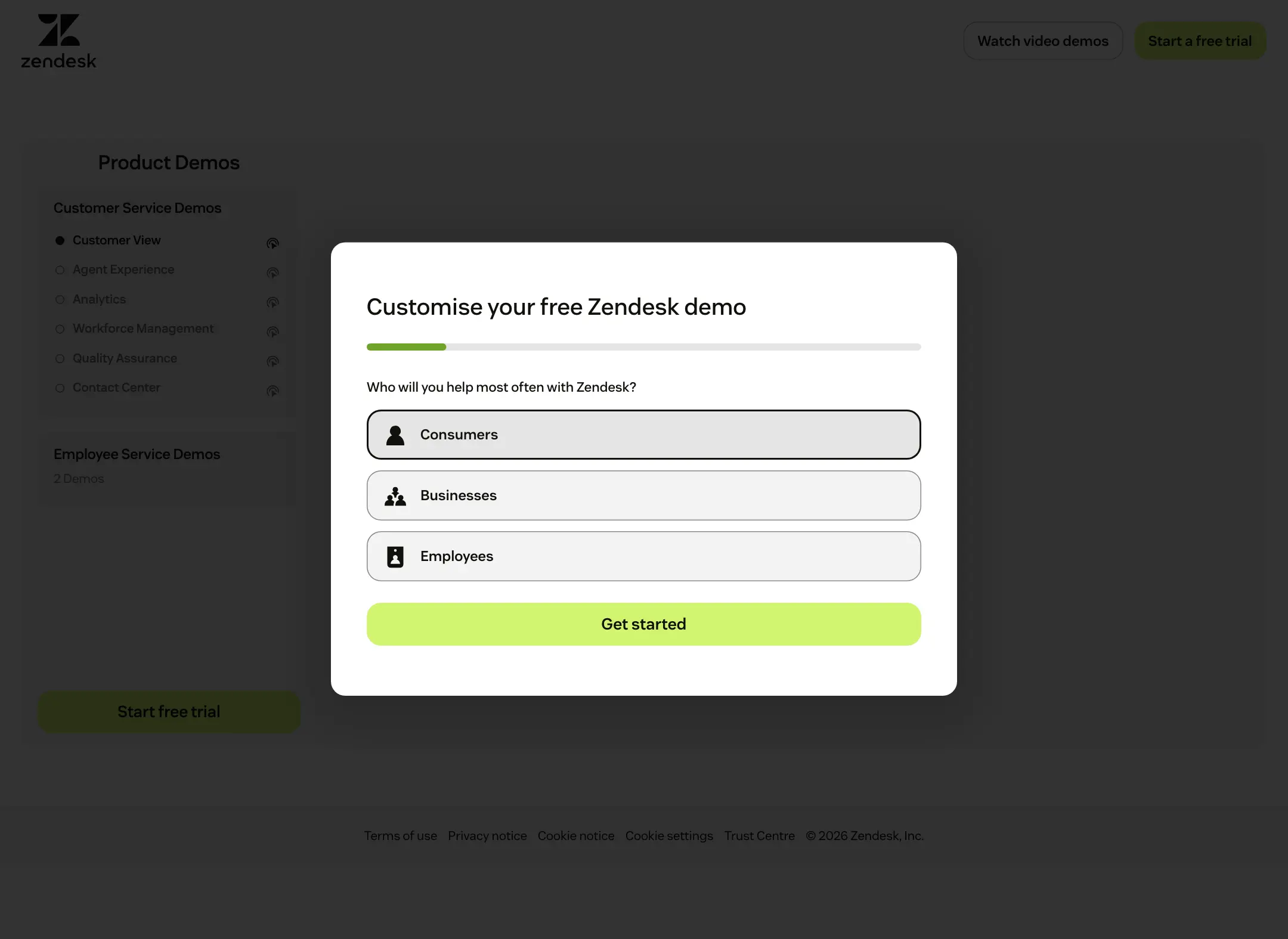
That first question is a good example of asking for context in sequence. The page can route the person to a more relevant demo instead of showing every possibility at once.
A service business can use the same move when the answer genuinely changes the experience. A website inquiry for an online store needs different follow-up from one for a membership site, so a first choice between them has a visible purpose.
I would avoid splitting a form into steps just to make a long form look shorter. The full request still has to be reasonable, and the visitor should understand the commitment before handing over personal details.
Choose the Pattern That Fits the Offer
The right pattern follows the visitor’s task. Settle the task first, then decide between a short form and a guided sequence.
| Visitor task | Pattern that fits | What to check |
|---|---|---|
| Try a self-service product | Clear entry offer and an easy first action | Required account details and paid-feature limits |
| Discuss a business purchase | Sales context with relevant qualification | Every required field and the response promise |
| See a relevant demo | A meaningful first choice | Whether the choice improves the next step |
| Request a service review | A specific problem and a realistic review offer | What the review includes and who handles it |
No single layout wins across all of these. A bigger commitment needs more explanation and qualification, while a low-commitment offer should never quietly turn into a high-commitment sales process.
Chris Pisarski, co-founder of Crustdata, passes on what a CIO told him about evaluating B2B products:
the person evaluating your product has already decided how much friction they’ll tolerate BEFORE they ever talk to you
Chris Pisarski on X, April 23, 2026
That’s a strong argument for showing some value before the sales step when the product allows it, and for making the sales step clearly worth it when it doesn’t.
Check the Full Journey
The first screen is only part of the experience. The page has to keep its promise through the form and the confirmation.
Review it in this order:
- Write down what the visitor expects from the ad, email or search result that brought them.
- Read the page’s offer as if you knew nothing about the product.
- Submit the form with a test record in a safe test setup.
- Check validation messages and mobile layout.
- Review the confirmation page and the follow-up email.
- Compare the whole experience with the promise made before the click.
The form optimization guide covers the form itself, the thank you page examples cover the step after it, and the conversion rate optimization guide helps you decide which part of the journey needs work first.
Measure the action that matches the task. A product-entry click and an accepted service inquiry are different events, and counting both as “conversions” makes a comparison look precise while hiding the difference that matters.
Adapt the Page Without Copying the Proof
The safest thing to borrow is the relationship between the offer and the action. Your wording and your evidence should come from your own business.
Before adapting an example, check:
- Does your audience arrive with a similar level of knowledge?
- Can you offer the same kind of immediate value?
- Does every requested field serve a real next step?
- Can your team keep the response or delivery promise?
- Does your proof support the claim beside it?
Start with one page and one primary action. If the offer is unclear, redesigning the cards won’t fix the main problem.
Paul Boag, a UX strategist who works on conversion, reviewed a landing page with 3 competing calls to action, 2 of which led to the same form:
Most teams don’t realize that every additional CTA is a choice your visitor has to make.
One clear path forward beats three mediocre options every time.
Paul Boag on X, March 2, 2026
FAQs on B2B Landing Pages
A good B2B landing page names a specific problem, makes one clear offer, asks for a commitment that fits the visitor’s readiness and explains what happens after they act. The form should only ask for information the team will actually use.
As long as the next step genuinely requires. A free product signup can work with an email address, while a sales inquiry may need company size and the type of help needed. Remove any field nobody uses to route or answer the request.
Use a free entry or trial when the product delivers value without setup help. Use a demo or sales conversation when the product needs migration, configuration or a pricing discussion before it makes sense.
You can borrow the structure, such as the order of offer, proof and form. Your wording, claims and customer evidence must be your own, and you should only show logos or results you have permission to use.
One primary action. A secondary link, such as a route to support, is fine when it serves a different visitor. Several competing calls to action make the visitor choose before they’ve understood the offer.
Final Remarks
Choose the one action your next visitor should complete and write its promise in plain language. If you can’t describe that promise in a sentence, no layout from these examples will fix the page.
Tell Google you want more of this.
Add Gatilab as a preferred sourceOne tap, and this site shows up more often in your own Top Stories, AI Overviews and AI Mode. Remove it any time.