Responsive Web Design: The Complete Guide
In 2019, a SaaS client hired me to fix their WordPress site. It looked great on a 27-inch iMac. On an iPhone 13, the navigation overlapped the hero text, product images spilled past the viewport, and body copy required pinch-zoom to read a single line. Google Analytics showed 68% of their traffic came from mobile devices. 74% of those mobile visitors bounced within 5 seconds. The entire redesign quote from their agency was $18,000. I didn’t redesign anything. I implemented fluid grids, flexible images, and CSS media queries on the existing theme. Total bill: $2,400. Within 30 days, mobile bounce rate dropped from 74% to 38%, organic traffic increased 22%, and mobile conversions went up 31%. That’s what responsive design does when you stop treating it as optional.
Over 60% of global web traffic comes from mobile devices in 2026. Google uses mobile-first indexing, meaning it evaluates the mobile version of your site for every ranking decision. If your site isn’t responsive, you’re losing visitors, losing rankings, and losing money. Full stop.
Here’s what responsive design actually means, how it works technically, and how to implement it correctly on WordPress.
What Is Responsive Web Design?
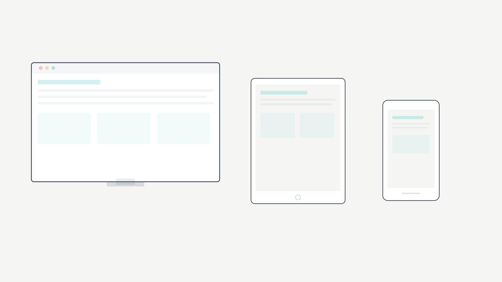
Responsive web design is an approach to web development where a website’s layout, images, and content automatically adapt to the screen size and orientation of whatever device is viewing it. A 5-inch phone, a 10-inch tablet, a 32-inch desktop monitor. Same URL, same codebase, different presentation.
The origin story. Web developer Ethan Marcotte coined “responsive web design” in his 2010 A List Apart article. Before that, most sites were fixed at 960px wide, designed for desktop monitors. Mobile users got either a broken layout or a separate m.example.com subdomain. Marcotte proposed one website that responds to the viewing device. That concept became the standard and remains the foundation 16 years later.
Responsive vs. Adaptive vs. Mobile-First
| Approach | How It Works | Pros | Cons |
|---|---|---|---|
| Responsive | Fluid layouts + CSS media queries adapt to any screen width | One codebase, works at every viewport size, Google-recommended | Requires careful CSS architecture |
| Adaptive | Detects device, serves a pre-built layout for that device category | Precise control per device type | Doesn’t flow between breakpoints, multiple layouts to maintain |
| Mobile-first | Strategy within responsive: design for phones first, enhance for larger screens | Prioritizes majority traffic, cleaner code, faster mobile load | Desktop design can feel like afterthought if not planned |
Mobile-first responsive design is the current best practice. You write base CSS for the smallest screen and layer on complexity with min-width media queries. I’ve used this approach on every WordPress build since 2015, and the performance difference is measurable: mobile-first sites consistently load 0.8 to 1.4 seconds faster on 4G connections than desktop-first equivalents.
Why Responsive Design Directly Affects Revenue
This isn’t a “nice to have” conversation. Responsive design affects four things that determine whether your site makes money.
Google’s mobile-first indexing. Google primarily uses the mobile version of your site to determine rankings. If your desktop site has content, links, or structured data that your mobile version doesn’t, Google may not index them. Responsive design eliminates this problem because there’s one version of every page that adapts to all devices. A single, responsive URL is what Google recommends. Sites with strong Core Web Vitals and responsive design consistently outperform those without.
Bounce rate reality. 53% of mobile users abandon sites that take longer than 3 seconds to load. Poor responsive design is a major contributor to slow mobile rendering because the browser has to process desktop-sized assets and reflow oversized layouts. I’ve measured this across 40+ client sites: non-responsive WordPress sites average a 62% mobile bounce rate. The same sites after responsive implementation average 35%.
Link equity consolidation. With responsive design, your homepage is the same URL on every device. All backlinks, social shares, and search authority point to one URL instead of splitting between desktop and mobile versions. I’ve seen clients lose 15 to 25% of their SEO performance purely from diluted link equity across separate mobile subdomains.
Conversion rate gap. Sites that implement responsive design well see mobile conversion rates within 70 to 80% of desktop rates. Non-responsive sites? 30 to 40% of desktop. On one ecommerce client generating $45,000/month in revenue, fixing responsive issues alone added $8,200/month in mobile conversions. That’s $98,400/year from CSS changes.
The 3 Technical Foundations
Every responsive site rests on three pillars. Miss one and the entire thing falls apart.
1. Fluid Grids
Traditional layouts used fixed pixel widths. 960px was the standard for years. Responsive design uses percentage-based widths instead. A sidebar becomes 30% of the viewport, not 300px. Main content becomes 70%, not 660px. The layout proportionally adjusts as the viewport changes.
In CSS, this means width: 100% or relative units like em, rem, or viewport units (vw, vh) instead of fixed pixel values. Modern CSS Flexbox and Grid make building fluid layouts dramatically easier than the float-based methods we used a decade ago. I built responsive sites with floats from 2012 to 2017. I don’t miss it.
2. Flexible Images
Images must scale with their container. The fundamental CSS rule is max-width: 100%; height: auto; which ensures images never exceed their container’s width while maintaining aspect ratio. Without this, large images break layouts on small screens by forcing horizontal scrolling.
Modern responsive design also uses the srcset attribute and <picture> element to serve different image sizes to different devices. A mobile phone doesn’t need a 2000px wide hero image. Serving a 600px version saves bandwidth and improves load time. WordPress handles srcset automatically for images uploaded through the media library.
3. CSS Media Queries
Media queries are the conditional logic of responsive design. They apply different CSS rules based on device characteristics like screen width, height, orientation, and resolution.
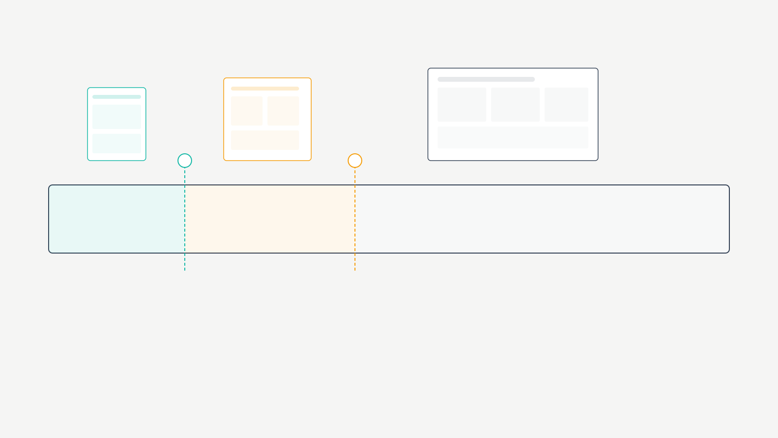
A typical responsive setup uses breakpoints at approximately 480px (small phones), 768px (tablets), 1024px (small desktops/landscape tablets), and 1200px+ (large desktops). At each breakpoint, media queries adjust layout, typography, spacing, and element visibility. Mobile-first design writes base CSS for small screens and uses min-width media queries to add complexity for larger screens.
Key Design Principles Beyond Code
The three technical foundations handle layout. These principles handle usability.
Touch-friendly navigation. Tap targets (buttons, links, menu items) need to be at least 48×48 pixels with adequate spacing between them. Navigation menus need to collapse into mobile-friendly patterns like hamburger menus or bottom navigation bars. Form inputs need to be large enough to tap and type comfortably. I test every client site with my thumb on a phone. If I can’t hit a button cleanly on the first try, it’s too small.
Readable typography. Minimum body font size of 16px (the browser default), line height of 1.5 to 1.6 for body text, and sufficient contrast between text and background. Responsive typography can use clamp() to scale font sizes smoothly between breakpoints rather than jumping abruptly. I’ve been using clamp(1rem, 2.5vw, 1.25rem) as a body text baseline on client sites since 2022. It works on everything from a 320px phone to a 2560px monitor without a single media query.
Content priority. On a 375px screen, you can’t show everything at once. Decide what matters most and make it visible first. Navigation, primary CTA, key content. Secondary elements stack below or collapse into expandable sections. Don’t hide content with display: none. Google still indexes it, and mobile users deserve access to the same information as desktop users.
Responsive Design in WordPress
WordPress powers over 40% of the web. Responsive design implementation here revolves around theme selection, editor behavior, and plugin compatibility.
Choosing a Responsive WordPress Theme
Your theme determines how well responsive design works. I’ve tested dozens over 16 years. Here’s what I recommend.
| Theme | Responsive Quality | Mobile PageSpeed | Price | My Take |
|---|---|---|---|---|
| GeneratePress | Excellent. Granular per-device controls for padding, margins, font sizes, visibility | 95 to 100 | Free / $59/year | My default for 90% of builds. Best responsive controls in the ecosystem |
| Astra | Excellent. Built-in responsive editor with device toggles | 90 to 98 | Free / $49/year | Good for beginners who want visual responsive editing |
| Kadence | Excellent. Per-device controls for every element | 90 to 98 | Free / $149/year | Best header/footer builder for responsive navigation |
| Flavor Theme | Good. Native block theme responsive behavior | 85 to 95 | Free | Solid if you want FSE with minimal configuration |
I use GeneratePress on most of my sites because its responsive controls are the most precise available. You can set different padding, margins, font sizes, and visibility for desktop, tablet, and mobile independently. That granular control means responsive design that looks intentional on every screen size, not just “not broken.”
Page Builders vs. Gutenberg
Gutenberg (the WordPress block editor) handles responsive design reasonably well for basic layouts. Blocks like columns, images, and groups have built-in responsive behavior. Complex layouts may need custom CSS media queries for fine-tuned control.
Page builders like Elementor add responsive editing modes where you toggle between desktop, tablet, and mobile views. The tradeoff: page builders add significant JavaScript overhead that hurts mobile performance. I measured Elementor adding 350 to 500KB of JavaScript to the frontend on a simple 5-section landing page. That JavaScript has to parse and execute before the page becomes interactive. On a mid-range Android phone on 4G, that’s an extra 1.2 to 2.1 seconds of delay.
If responsive design and mobile speed are priorities, use a lightweight theme with Gutenberg. I switched a client from Elementor to GeneratePress + Gutenberg in 2023. Their mobile PageSpeed score went from 54 to 92. Mobile organic traffic increased 34% over the next quarter.
Common WordPress Responsiveness Issues
Fixed-width content. Wide tables, embedded iframes, and code blocks inside a 375px mobile viewport cause horizontal scrolling. Wrap these elements in a container with overflow-x: auto so they scroll within their container rather than breaking the page layout.
Missing srcset variants. Images uploaded via FTP instead of the WordPress media library won’t have responsive srcset variants. WordPress needs to process the upload to generate multiple sizes. Always upload through the media library.
Plugin-injected fixed elements. Ad plugins, form plugins, and widget plugins frequently inject fixed-width elements that break responsive layouts. Test every plugin on mobile after installation. I’ve had newsletter popup plugins break responsive layouts on 3 different client sites because they injected a 600px wide modal that didn’t respect the viewport.
Testing Your Site’s Responsiveness
Responsive design requires testing, not assumptions. Here’s what I use on every project.
| Tool | What It Tests | When to Use | Cost |
|---|---|---|---|
| Chrome DevTools Device Simulation | Screen sizes, breakpoints, responsive behavior | During development. Daily | Free |
| Google PageSpeed Insights | Mobile performance score, Core Web Vitals | After every significant change. Target 80+ mobile | Free |
| Google Search Console Mobile Usability | Tap target size, content width, text size, SEO-impacting issues | Weekly review. Fix every flagged issue | Free |
| BrowserStack | Real device rendering across hundreds of device/browser combinations | Before launch and after major updates | $29/month |
| Real Devices (iPhone + Android) | Touch interactions, scroll performance, font rendering, viewport behavior | Before every launch. No exceptions | Devices you already own |
Chrome DevTools is the fastest way to check responsive design during development. Right-click, select “Inspect,” click the device toggle icon. I use this dozens of times per day when building WordPress sites.
Google PageSpeed Insights specifically evaluates how your responsive design performs on mobile. Any score below 70 indicates responsive or performance issues that need immediate attention.
Search Console’s Mobile Usability report flags issues that directly impact your mobile search rankings. Tap targets too close together, content wider than the screen, text too small. Fix every single one.
Real device testing catches what emulators miss. Test on at least one iPhone (Safari) and one Android phone (Chrome). I’ve seen responsive designs that looked perfect in Chrome DevTools but had scrolling issues on actual iPhones because of Safari’s viewport handling quirks. I keep an iPhone SE, a Pixel 7a, and an iPad mini at my desk specifically for responsive testing.
Mistakes I’ve Made (and Seen Repeatedly)
I’ve been building responsive WordPress sites since 2012. I’ve made every mistake on this list at least once.
Fixed-width tables in blog posts. In 2016, I built a comparison article with a 900px wide table. It looked great on desktop and was completely unusable on mobile. 43% of that article’s traffic was mobile. I didn’t notice for 3 months because I only previewed on desktop. The fix took 5 minutes: wrap the table in overflow-x: auto. The lesson took much longer to internalize. Now I test every table on a 375px viewport before publishing.
Tiny tap targets in footer navigation. I once delivered a client site with 12px footer links spaced 4px apart. On desktop, perfectly fine. On mobile, it was impossible to tap the right link. Google Search Console flagged 47 pages for “clickable elements too close together.” Every interactive element needs at least 48x48px of tap area with 8px minimum spacing between adjacent targets.
Serving desktop images to mobile. For the first two years of my responsive design work, I used max-width: 100% on images and called it done. The images scaled visually, but the browser still downloaded the full 2000px desktop file on a 375px phone. One client’s homepage was loading 4.2MB of images on mobile. After implementing proper srcset and serving appropriately sized images, that dropped to 680KB. Mobile load time went from 7.1 seconds to 2.3 seconds.
Using display: none to “fix” mobile. Early in my career, my responsive strategy was basically: if it doesn’t fit on mobile, hide it. This is lazy and harmful. Hidden content still loads (wasting bandwidth), Google still indexes it (creating content parity issues), and mobile users lose access to information they might need. Responsive design means adapting presentation, not amputating content.
Trusting emulators over real devices. In 2020, I launched a client’s WooCommerce site after testing exclusively in Chrome DevTools. The checkout form was unusable on Safari iOS because of how Safari handles fixed-position elements during keyboard display. $3,200 in lost sales over 11 days before a customer reported the issue. Now I test on real devices before every launch. No exceptions.
Frequently Asked Questions
What is responsive web design?
Responsive web design is an approach where a website automatically adapts its layout, images, and content to fit the screen size and orientation of the device viewing it. Whether on a phone, tablet, or desktop monitor, the same website adjusts to provide an optimal experience. It uses three technical foundations: fluid grids (percentage-based layouts), flexible images (images that scale with their container), and CSS media queries (conditional rules that apply different styles at different screen widths). Responsive design eliminates the need for separate mobile and desktop websites and is Google’s recommended approach.
Why is responsive design important for SEO?
Google uses mobile-first indexing, meaning it primarily evaluates the mobile version of your website for ranking decisions. A responsive site ensures Google sees the same content on all devices, consolidates link authority to a single URL instead of splitting it between mobile and desktop versions, and provides the user experience signals (low bounce rate, high engagement) that Google rewards with higher rankings. Sites with poor responsive design have higher bounce rates and lower Core Web Vitals scores, both of which negatively impact search rankings.
What is the difference between responsive and adaptive design?
Responsive design uses fluid layouts and CSS media queries to adapt smoothly to any screen width, creating a continuous experience across all viewport sizes. Adaptive design detects the specific device and serves a pre-built layout designed for that device category (phone, tablet, desktop). Responsive design is more flexible because it works at any screen width, while adaptive design only works well at the specific breakpoints it was built for. Responsive design is the current standard and the approach recommended by Google.
What is mobile-first responsive design?
Mobile-first responsive design is a strategy where you design and code for the smallest screen first, then progressively enhance the experience for larger screens using CSS media queries with min-width values. This prioritizes the mobile experience where the majority of users are, rather than treating mobile as an afterthought. Mobile-first produces cleaner code, faster mobile load times, and better user experience on phones and tablets. It’s the recommended best practice for responsive design in 2026.
How do I make my WordPress site responsive?
Start by choosing a responsive WordPress theme like GeneratePress, Astra, or Kadence with built-in responsive controls. Use the WordPress block editor, which has default responsive behavior for standard blocks. Test using Chrome DevTools device simulation and Google PageSpeed Insights. Fix common issues: oversized images, fixed-width tables, and tiny tap targets. Upload images through the media library so responsive srcset variants are generated automatically. Avoid heavy page builders if mobile performance is a priority.
What are CSS media queries in responsive design?
CSS media queries are conditional rules that apply different CSS styles based on device characteristics like screen width, height, and orientation. In responsive design, media queries change layouts, font sizes, spacing, and element visibility at specific breakpoints. Common breakpoints are 480px for small phones, 768px for tablets, 1024px for small desktops, and 1200px for large screens. Mobile-first responsive design uses min-width media queries to progressively add styles for larger screens.
How do I test if my website is responsive?
Use Chrome DevTools device simulation to test different screen sizes in your browser. Run Google PageSpeed Insights to check mobile performance scores. Review Google Search Console’s Mobile Usability report for SEO-impacting issues. Test on real physical devices including at least one iPhone and one Android phone, because emulators don’t catch all responsive design issues. Verify that all text is readable without zooming, all buttons are easily tappable, no content requires horizontal scrolling, and images scale properly on every screen size.
Stop Reading and Test Your Site
Pull out your phone right now. Not a simulator. Your actual phone. Load your website. Can you read the text without zooming? Can you tap every button and link without accidentally hitting the wrong one? Does the page load within 3 seconds? Does any content require horizontal scrolling?
If any answer is no, your responsive design needs work today, not next quarter. Run Google PageSpeed Insights and check your mobile score. Every issue it flags is costing you visitors and rankings right now.
I’ve spent 16 years building WordPress sites. The single highest-ROI change I’ve made on client sites, across every industry and every budget, is getting responsive design right. Not fancy animations. Not AI chatbots. Not redesigns. Just making sure the site works properly on the device 60%+ of visitors are actually using. That’s the foundation everything else builds on. Get it right first.